Navigating the dashboard
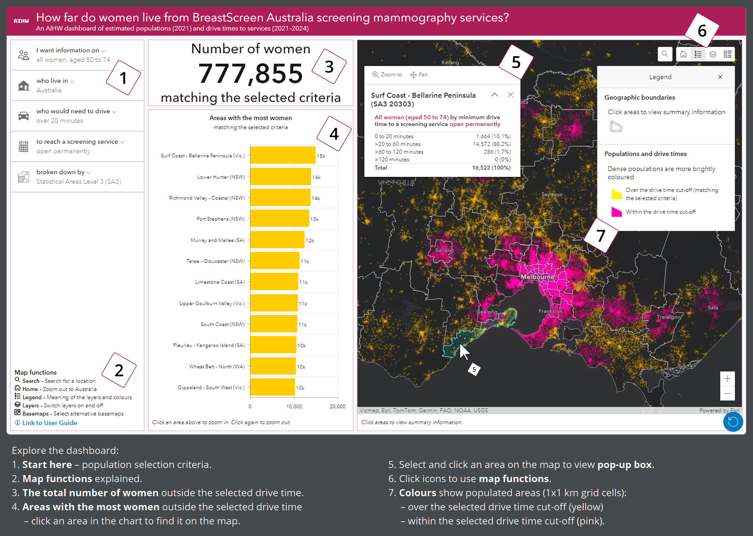
1. Start here
Select the population, drive time, service type and geographic breakdowns of interest.
2. Map functions
Refer to this key for an explanation of the icons in the top right corner of the map.
3. Women who live outside of the selected drive time
The number of women aged 50–74 from the selected population (by Indigenous status and state/territory) who live outside the selected drive time from a screening site open at the selected frequency.
When a drive time of 'over 0 minutes (everyone)’ is selected, all women of the selected population are included.
4. The areas (region type selected in the left panel) with the most women outside of the selected drive time
The number of women from the selected population who live outside the selected drive time from a screening site open at the selected frequency, split by area.
In the default view, the chart shows the 12 SA3s in Australia with the most women living over a 20-minute drive from a screening service open permanently.
Click on an area’s yellow rectangular bar or name to locate it. This will re-position the map in the right panel to the selected area.
Hover over areas in the chart to view the estimated number of women.
Visit Interactive Charts and Data to find information for extra geographic areas and for a complete ranking of areas and their population size.
5. Pop-up box
On the map, click on an area of interest to view extra information about drive times in that entire area.
Note that if you change an option in the left panel or click on a different area in the central panel, you will need to close and re-open the pop-up box to update the information in the pop-up box (otherwise it will not match your new population).
6. Select map functions to:
- view the legend
- search for places and postcodes using free text
- switch off layers
- view alternative basemaps.
A blue reset button appears in the lower right corner, which can clear any selections and return the map to its default position.
7. Coloured population grid showing populated areas (1x1 km grid cells):
- over the selected drive time cut-off (yellow – matching the selected criteria)
- within the selected drive time cut-off (pink).
In the default view, yellow squares are over a 20-minute drive from a screening service open permanently, and pink squares are within a 20-minute drive.
Dense populations are more brightly coloured:
- ≥200 women per square kilometre (brightest)
- ≥100–200 women per square kilometre
- ≥10–100 women per square kilometre
- ≥1–10 women per square kilometre (dullest).
Areas that are not coloured either have no estimated population or fewer than one woman per square kilometre.
In the screenshot (above), the information in the central panel shows:
- An estimated 777,855 women aged 50–74 in Australia need to drive over 20 minutes to reach a screening service that is open permanently.
- Based on the selections in the left panel, the SA3 with the most women who need to drive more than 20 minutes is ‘Surf Coast – Bellarine Peninsula’ in Victoria.
- Hovering over the rectangular bar for ‘Surf Coast – Bellarine Peninsula’ shows the estimated number of women living outside a 20-minute drive in this area: 14,858 women from the selected population (all women aged 50–74).
In the screenshot’s map, the information in the pop-up box shows:
- An estimated 16,522 women aged 50–74 live in the SA3, ‘Surf Coast – Bellarine Peninsula’.
- Most women (14,572 or 88%) need to drive more than 20 minutes but not more than 60 minutes to reach a screening service that is open permanently. No women have to drive more than 120 minutes.
Comparing an area’s population numbers from the chart and the pop-up box:
- For each area, the population number in the chart can be different to the numbers in the pop-up box.
- The number in the chart relates to the selected drive time cut-off, while the numbers in the pop-up box show 4 non-overlapping drive time ranges and the total population. Numbers in the pop-up box are not affected by the selected drive time cut-off.
Looking at the population distribution:
- The ‘Surf Coast – Bellarine Peninsula’ SA3 is relatively long and narrow in shape.
- The coloured grid shows a concentration of women on the Bellarine Peninsula (north east) farther than 20 minutes from a permanent service. Another relatively dense population lives in and around Torquay, close to the midpoint of the SA3. Communities along the southern coast are more sparsely populated.
If you would like more information to find what you are looking for, or interpret the information presented by the dashboard, contact us using the feedback form:
SUBMIT FEEDBACK