Data visualisation
Mortality Over Regions and Time (MORT) data
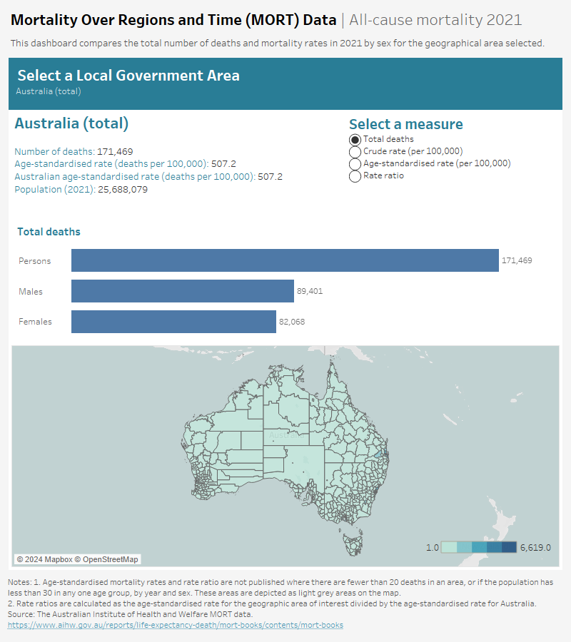
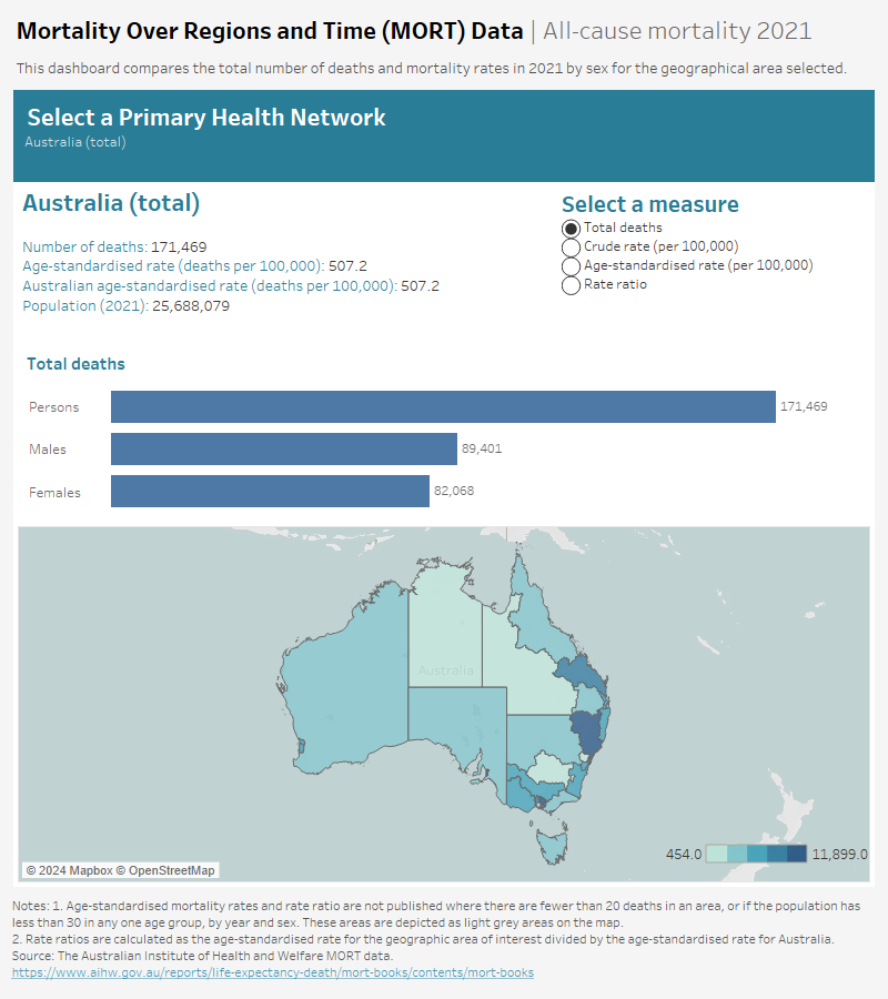
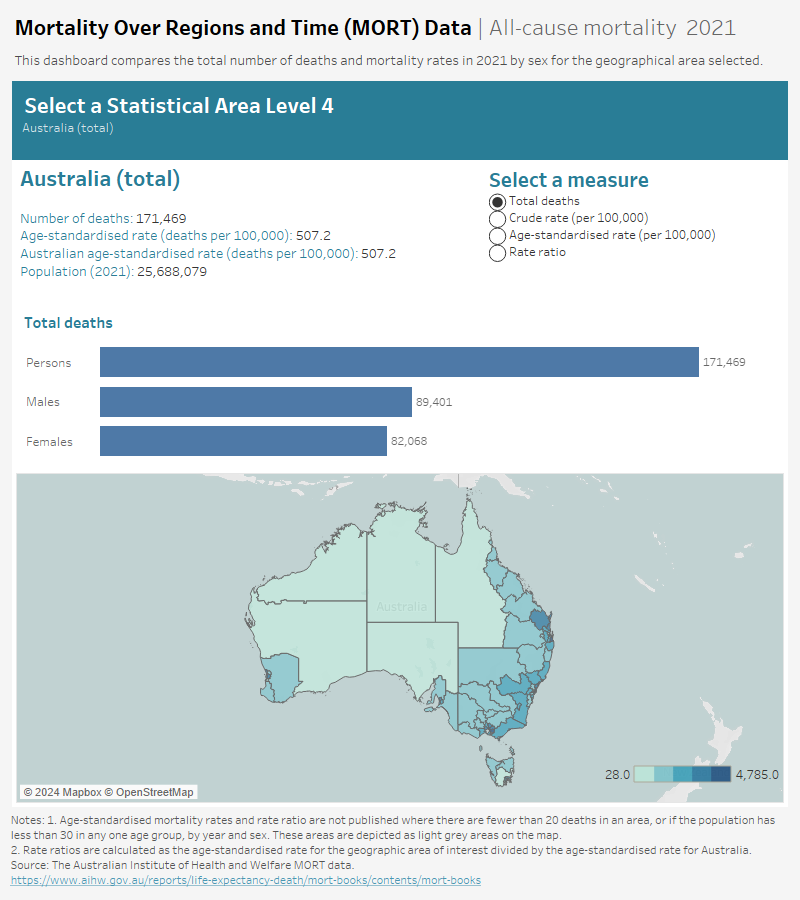
MORT data visualisation contains mortality data for the most recent year (2021) by specific geographical areas in an interactive format. There are 4 dashboards for the selected level of geography:
- Dashboard 1: "Snapshot" compares the total number of deaths and mortality rates in 2021 by sex for the geographical area selected.
- Dashboard 2: "Comparison" compares mortality statistics in 2021 for the geographical areas within each state and territory.
- Dashboard 3: "Leading causes of death" presents mortality statistics for the leading 20 causes of death in the geographical area selected, 2017–2021 combined.
- Dashboard 4: "Selected causes of death" presents mortality statistics for the top 20 causes of death for Australia by sex and geographical area, 2017–2021 combined.
On the map, if an area is zoomed in or out, click on the zoom home icon on the left side to allow correct display of another selected area. Machine readable forms of the MORT data are available on data.gov.au.
Information on the leading 20 causes of death for each geographical area are available in the MORT Excel workbooks.


