Data visualisations help
The Adoptions Australia data visualisations allow you to explore data to find out more about adoption in Australia. This page will help you to get the most out of the displays.
Exploring displays
Switching between number and proportion
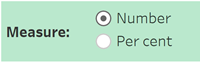
Where available, a menu above each chart can be used to switch between displaying numbers and proportions. Generally, number will be selected by default when you open a display page.
Reading data points
Additional information will appear when clicking or hovering over a bar in a bar chart, or a point on a trend line. This includes the value represented by the bar/point.
Customising displays
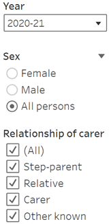
Use the filters and dropdown menus on a display to select and deselect variables. These are located to the right of each display. Charts will automatically update to reflect the chosen variables.