Distribution of BMI

The interactive graphs below allow you to explore selected percentiles of BMI within the birth cohorts as they age. This allows for a better understanding of changes in the distribution of BMI over time, beyond changes in the prevalence of overweight or obesity.

The following interactive graph shows how the selected percentile of BMI has changed for each birth cohort over time. The percentiles available are the 90th percentile, 75th percentile, median (or 50th percentile), 25th percentile and 10th percentile. These selected percentiles show the changes over time at different points in the distribution of BMI, including near the bottom- and top-ends. See the Differences between birth cohorts and Changes over time sections for findings on the differences and changes in median BMI.

Figure 1: BMI percentiles, by birth cohort and age group; 1995, 2007–08 and 2017–18

These line charts show the 10th, 25th, 50th (median), 75th and 90th percentiles of BMI for 7 adult birth cohorts, with data for each cohort shown at the midpoint of the cohort’s age group for up to 3 time points (1995, 2007–08 and 2017–18).  For most cohorts, the 75th and 90th percentile of BMI increased between 1995 and 2007–08, and between 2007–08 and 2007–18. There was generally less change over time for the 10th and 25th percentile of BMI.

Visualisation not available for printing

90th percentile of BMI

The 90th percentile of BMI is the value at which 90% of people have a BMI value below it, or conversely, 10% of people have a BMI value above it. All cohorts had 90th percentile values that were within the obese range of BMI values.

Between 1995 and 2007–08, the 90th percentile of BMI increased significantly for most birth cohorts, excluding the 1923–1932 and 1933–1942 birth cohorts (Figure 1, Table S4).

Between 2007–08 and 2017–18, the 90th percentile of BMI increased significantly for all birth cohorts.

The largest absolute change in the 90th percentile of BMI over the 22 years was among the 1963–1972 birth cohort. For this cohort, the 90th percentile of BMI increased from 31.3 kg/m2 at age 23–32 (in 1995) to 34.3 kg/m2 at age 35–44 (in 2007–08), and increased again to 36.6 kg/m2 at age 45–54 (in 2017–18), corresponding to an increase of 5.3 kg/m2 over the 22 years.

10th percentile of BMI

The 10th percentile of BMI is the value at which 10% of people have a BMI value below it, or conversely, 90% of people have a BMI value above it. All cohorts had 10th percentile values that were within the normal weight range of BMI values (18.50–24.99 kg/m2).

Between 1995 and 2007–08, the 10th percentile of BMI increased slightly for most birth cohorts, except there was no change for the 1933–42 birth cohort and the 1923–1932 birth cohort decreased slightly (Figure 1, Table S4).

Between 2007–08 and 2017–18, the 10th percentile of BMI again increased slightly for almost all birth cohorts, except there was no change for the 1933–1942 birth cohort.

The largest absolute change in the 10th percentile of BMI over the 22 years was among the 1963–1972 birth cohort. For this cohort, the 10th percentile of BMI increased from 20.2 kg/m2 at age 23–32 (in 1995) to 21.3 kg/m2 at age 35–44 (in 2007–08), and increased again to 22.2 kg/m2 at age 45–54 (in 2017–18), corresponding to an increase of 2.0 kg/m2 over the 22 years.

Overall there were much smaller increases in the 10th percentile of BMI within cohorts than there were for the 90th percentile of BMI, which indicates that the top-end of the BMI distribution is increasing faster than the bottom-end.

Box plots of BMI

Box plots give additional insights into changes in the shape of the distribution of BMI over time within birth cohorts and differences between birth cohorts.

The focus of this section is on how the distribution of BMI has changed over time for the 4 birth cohorts that were observed in all 3 of the selected years: 1995, 2007–08 and 2017–18. These birth cohorts range from 1963–1972 (youngest cohort) to 1933–1942 (oldest cohort). Data for the remaining birth cohorts can be shown in Figure 1 for the available survey years by ticking the check-box for each respective cohort.

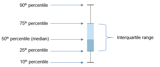
How to read box plots

The values shown in the box plots below are the 10th percentile, 25th percentile, the median (or 50th percentile), 75th percentile and 90th percentile.

As an example of interpreting the percentiles, the 25th percentile shows at what BMI value 25% of the population has a BMI lower than this, and conversely 75% of the population has a BMI higher than this.

The interquartile range (IQR) is a measure of the variability or spread of the BMI values and is the difference between the 75th percentile (or 3rd quartile) and the 25th percentile (or 1st quartile) values.

example box plot


Figure 2: Box plots of BMI, by birth cohort and age group; 1995, 2007–08 and 2017–18

This chart presents box plots of BMI to show the changing distribution of BMI over time for 7 birth cohorts at different age groups, for up to 3 survey years (1995, 2007–08 and 2017–18). Of the 7 cohorts, 4 cohorts have data available for all 3 of the selected survey years (the 1933–1942, 1943–1952, 1953–1962 and 1963–1972 cohorts). In general, younger cohorts show a larger upwards shift in BMI distribution over time, especially in the upper end of BMI distribution (90th and 75th percentiles). The distribution of BMI values widened over time across all the birth cohorts measured in all 3 time points.

Visualisation not available for printing

The younger cohorts, especially the 1963–1972 and 1953–1962 birth cohorts, show a larger upwards shift in the distribution of BMI over time compared with the 1933–1942 cohort. The largest increases are occurring towards the upper end of the BMI distribution at the 75th and 90th percentiles (Figure 2, Table S4).

The distribution of BMI values widened over time across all the birth cohorts measured at all 3 time points. The interquartile range increased slightly more in the younger cohorts, from 5.6 kg/m2 at age 23–32 to 7.7 kg/m2 at age 45–54 for the 1963–1972 birth cohort. This is compared with the slightly smaller increase from 5.5 kg/m2 at age 53–62 to 7.0 kg/m2 at age 75–84 for the 1933–1942 birth cohort, which appears to be due to an increase in the 75th percentile while the 25th percentile remained stable over time.

References

ABS (Australian Bureau of Statistics) 2009. Microdata: National Health Survey, Basic and Expanded CURF, 2007–08. ABS cat. no. 4324.0.55.001. Findings based on Expanded Confidentialised Unit Record File analysis. Canberra: ABS.

ABS 2013. Microdata: National Nutrition Survey, 1995. ABS cat. no. 4807.0.30.001. Findings based on Basic Confidentialised Unit Record File analysis. Canberra: ABS.

ABS 2019. Microdata: National Health Survey, 2017–18. ABS cat. no. 4324.0.55.001. Findings based on Detailed Microdata analysis. Canberra: ABS.