Exploring the potentially preventable hospitalisations data
The likelihood of a person having a potentially preventable hospitalisation (PPH) can vary according to their age, sex, where they live, their level of socioeconomic disadvantage, and Indigenous status.
On this page
PPH by Indigenous status, remoteness and socioeconomic disadvantage
PPH by Indigenous status, age and sex
The information in this web report should be looked at in conjunction with Disparities in potentially preventable hospitalisations across Australia, 2012–13 to 2017–18. The PDF report explores disparities in PPH between populations and provides information to help users interpret the PPH data.
A summary of findings is available in the fact sheet.
Age and sex
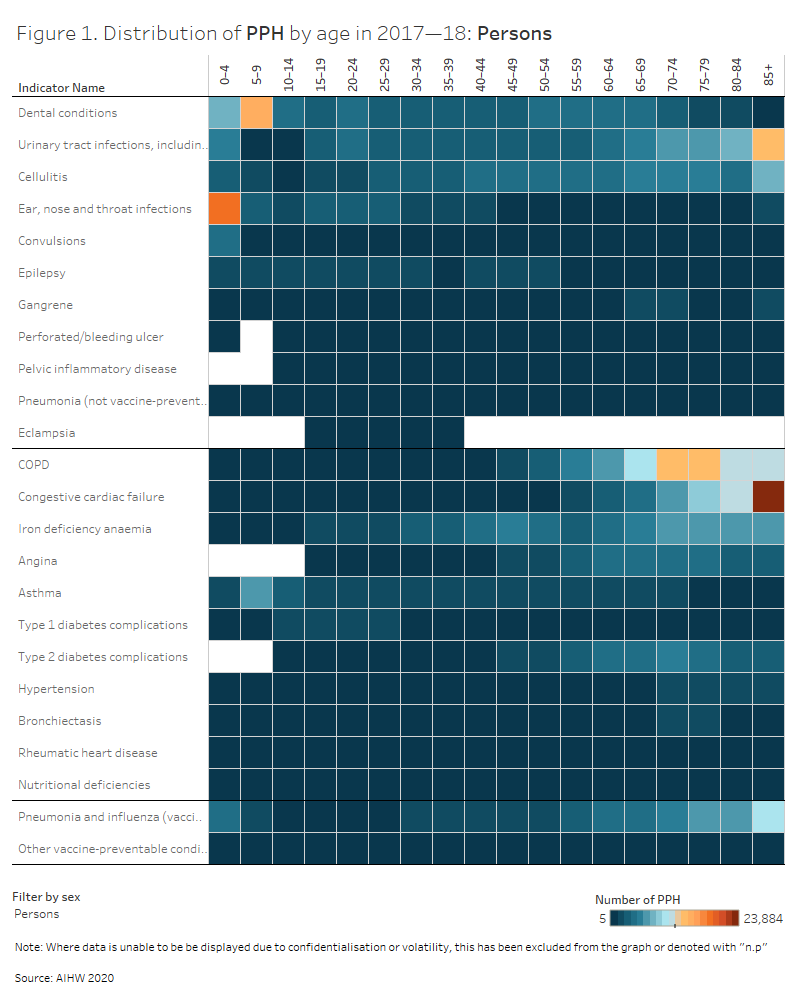
The likelihood of a person having a PPH varies with age and sex.
Use the interactive graph to explore the number of admissions for each PPH condition in 2017–18, by five-year age groups, and see how causes of PPH vary across life stages for males, females and persons.
“Hover text” includes information on the average length of stay and proportion of same day admissions, which can also be found in the data tables.
Indigenous status, remoteness and socioeconomic disadvantage
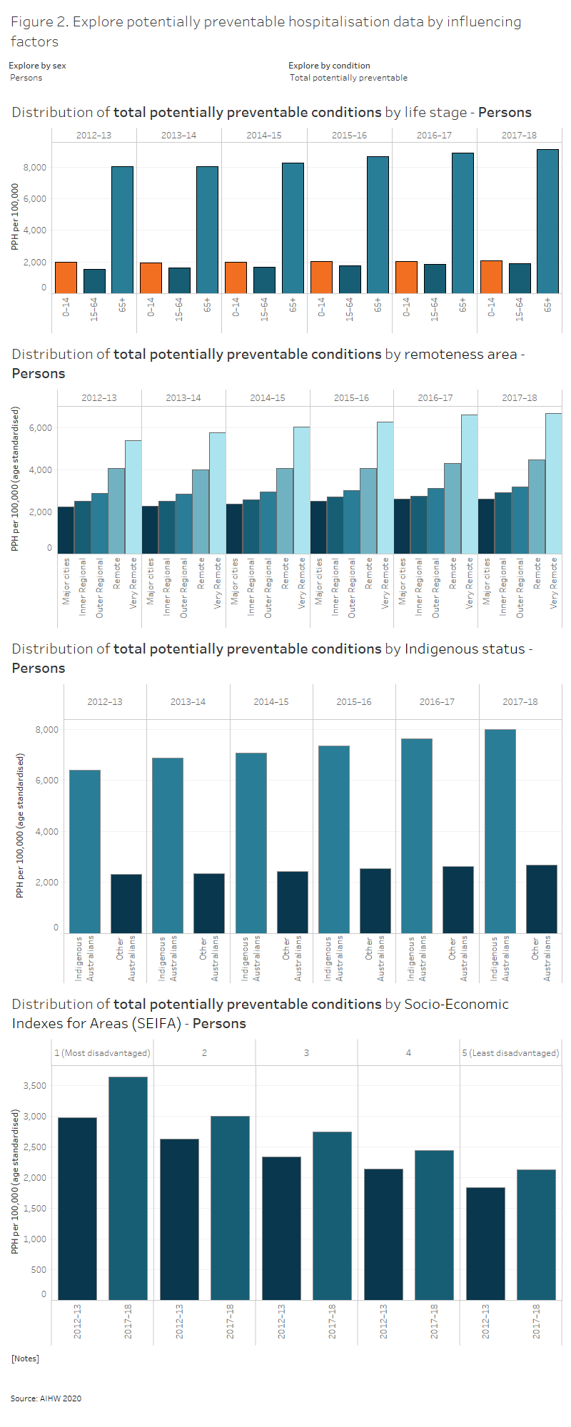
PPH rates have frequently been shown to increase with increasing remoteness and socioeconomic disadvantage, and both factors disproportionately affect Indigenous Australians (Duckett & Griffiths 2016; ACSQHC & AIHW 2017)
Use the interactive graph to explore PPH rates by life stage (0–14, 15–64 and 65+ years), Indigenous status, remoteness and the socioeconomic disadvantage of an area, for males, females and persons, from 2012–13 to 2017–18.
“Hover text” includes information on the number of PPH, average length of stay and proportion of same day admissions, which can also be found in the data tables.
Indigenous status, age and sex
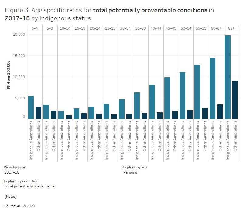
Use the interactive graph to explore differences in PPH rates by Indigenous status and 5-year age group, for males, females and persons, for the years 2012–13 to 2017–18.
“Hover text” includes information on the number of PPH, which can also be found in the data tables.
Small geographic areas
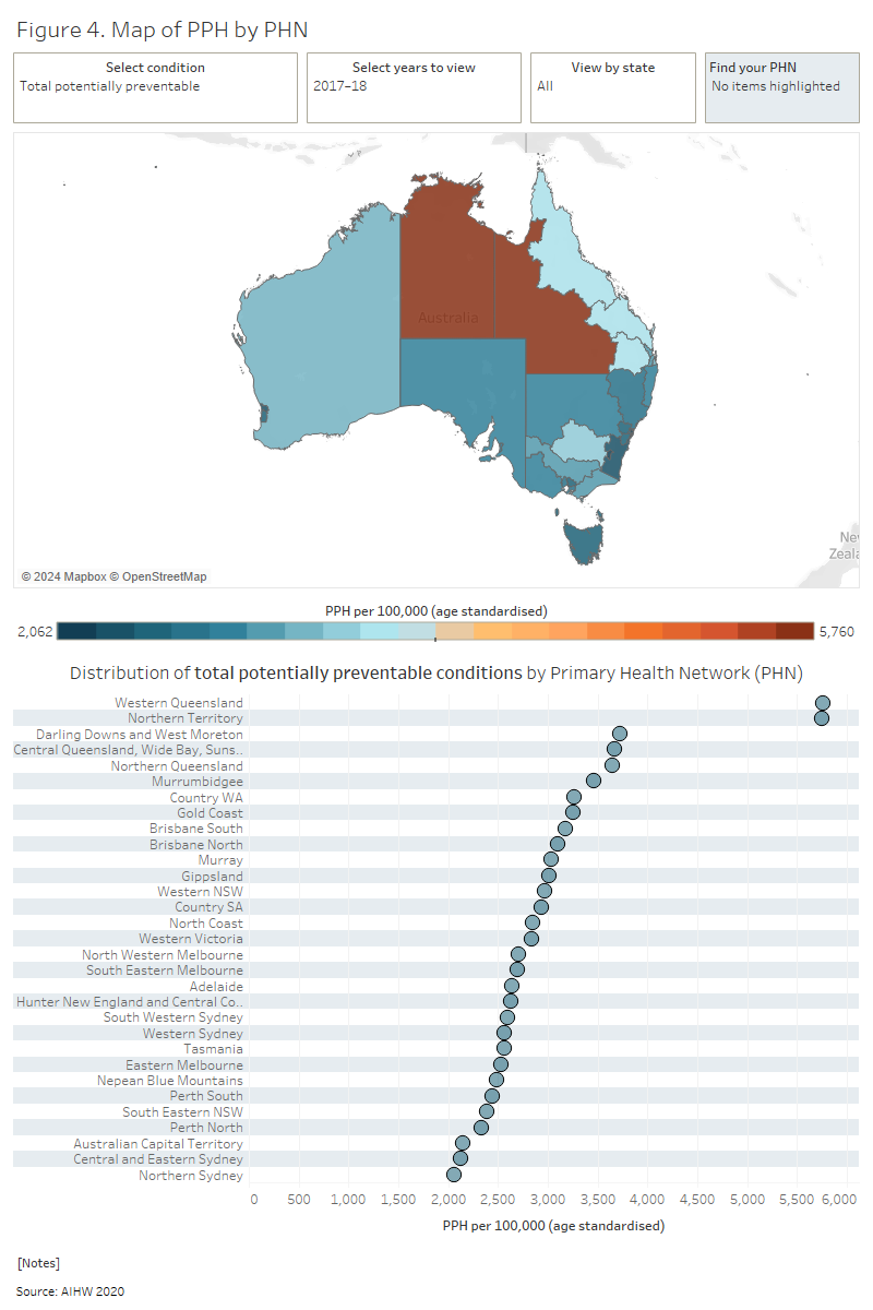
Variation in PPH rates within a region, or between areas with similar characteristics, can be used to identify and investigate areas or populations of need (Falster & Jorm 2017).
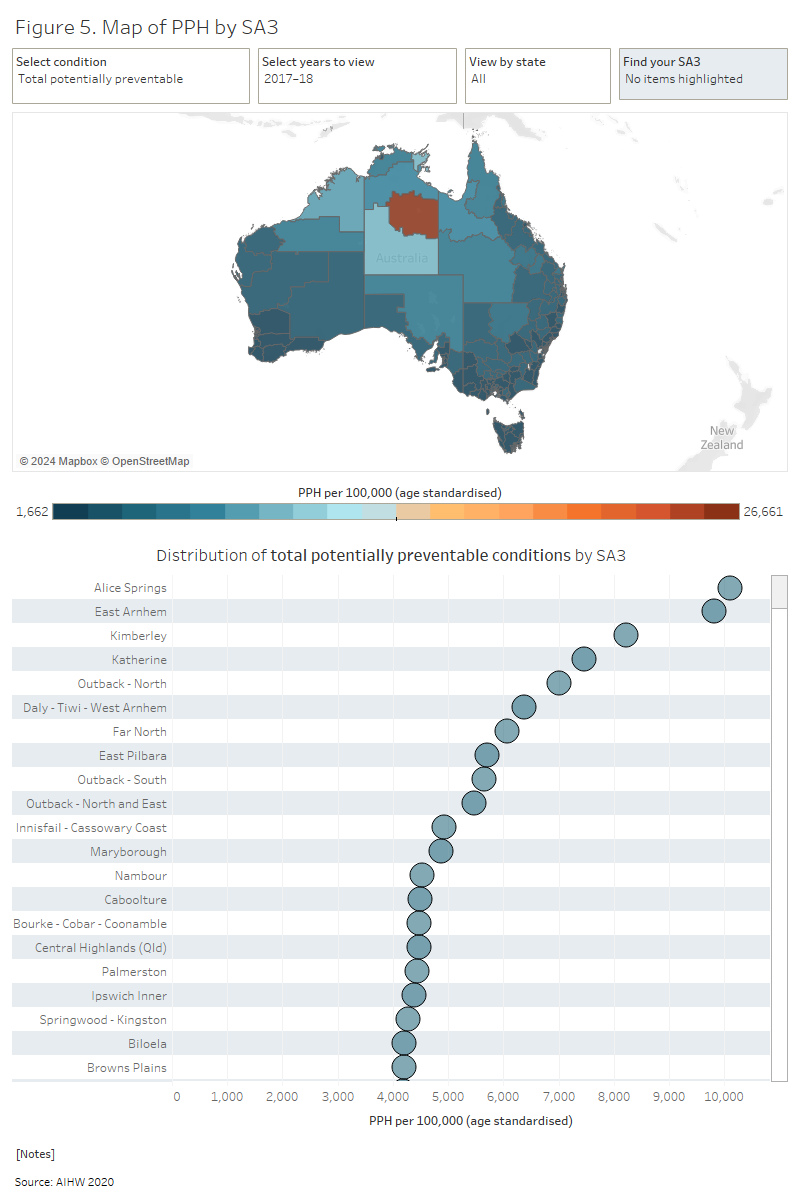
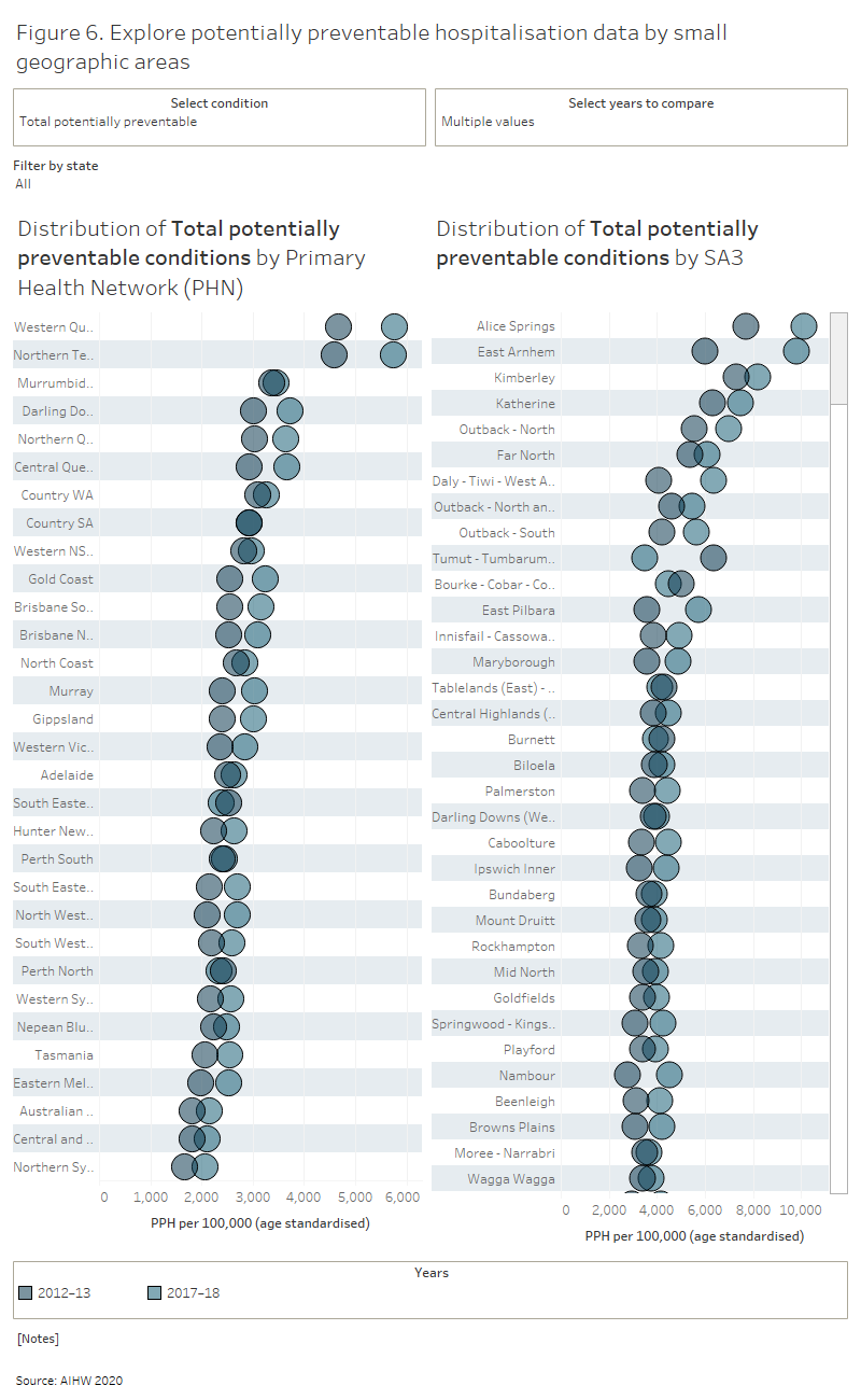
Use the interactive maps and graphs to explore variation in PPH rates across small geographic areas (PHNs and SA3s) between 2012–13 and 2017–18.
“Hover text” includes information on the number of PPH, average length of stay and proportion of same day admissions, which can also be found in the data tables.
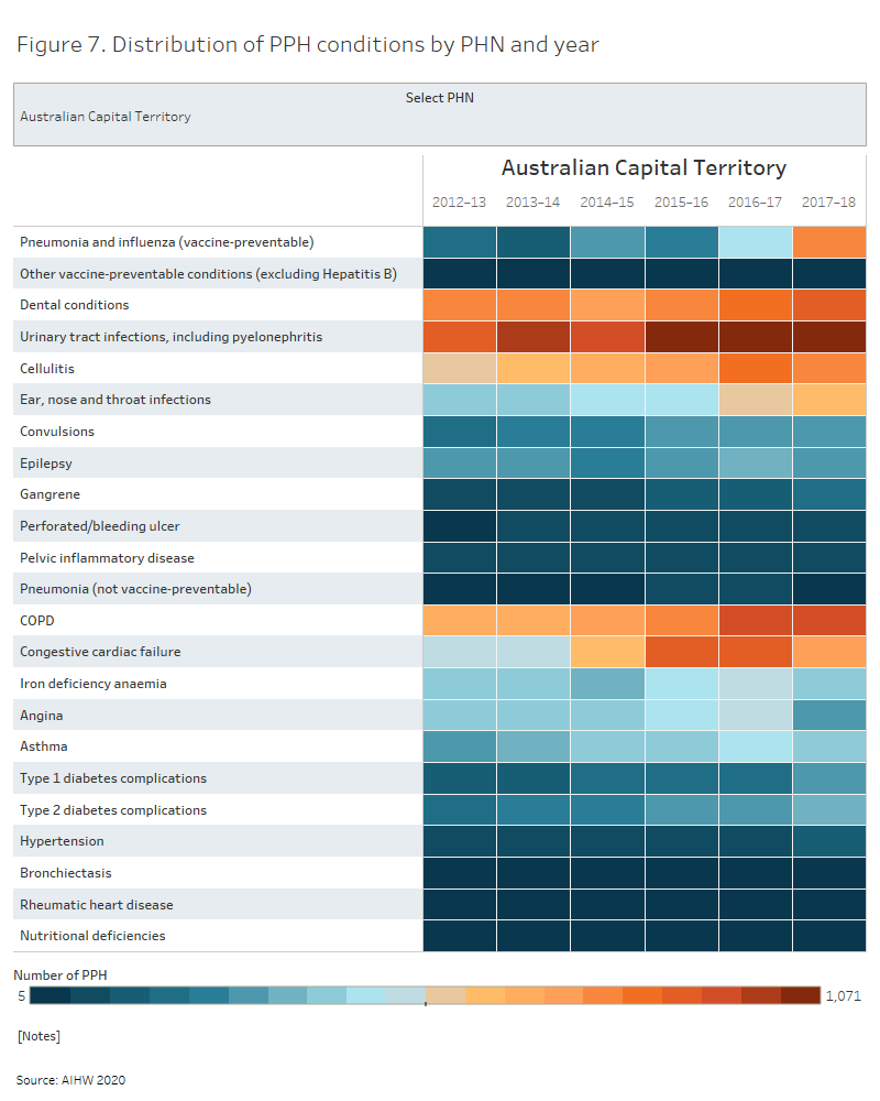
Distribution of potentially preventable hospitalisations within a PHN
Use the interactive graph to explore trends in PPH rates within a PHN between 2012–13 and 2017–18.
“Hover text” includes information on the number of PPH, average length of stay and proportion of same day admissions, which can also be found in the data tables.
Distribution of potentially preventable hospitalisations within an SA3 area
Use the interactive graph to explore trends in PPH rates within an SA3 area between 2012–13 and 2017–18.
“Hover text” includes information on the number of PPH, average length of stay and proportion of same day admissions, which can also be found in the data tables.

References
ACSQHC (Australian Commission on Safety and Quality in Health Care) & AIHW (Australian Institute of Health and Welfare) 2017. The Second Australian Atlas of Healthcare Variation. Sydney: ACSQHC.
Duckett S & Griffiths K 2016. Perils of Place: identifying hotspots of health inequalities. Melbourne: Grattan Institute.
Falster M & Jorm L 2017. A guide to the potentially preventable hospitalisations indicator in Australia. Centre for Big Data Research in Health, University of New South Wales, in consultation with the Australian Commission on Safety and Quality in Health Care and the Australian Institute of Health and Welfare. Sydney: ACSQHC.


