Cancer by key populations data visualisation
The figures below display cancer incidence, survival and mortality in people aged 15–24, by Indigenous status, remoteness, socioeconomic quintile, and state/territory.
The small numbers of cases and deaths in these populations can result in large fluctuations in calculated rates so confidence intervals are displayed to provide a sense of the potential variability of the rates.
Incidence
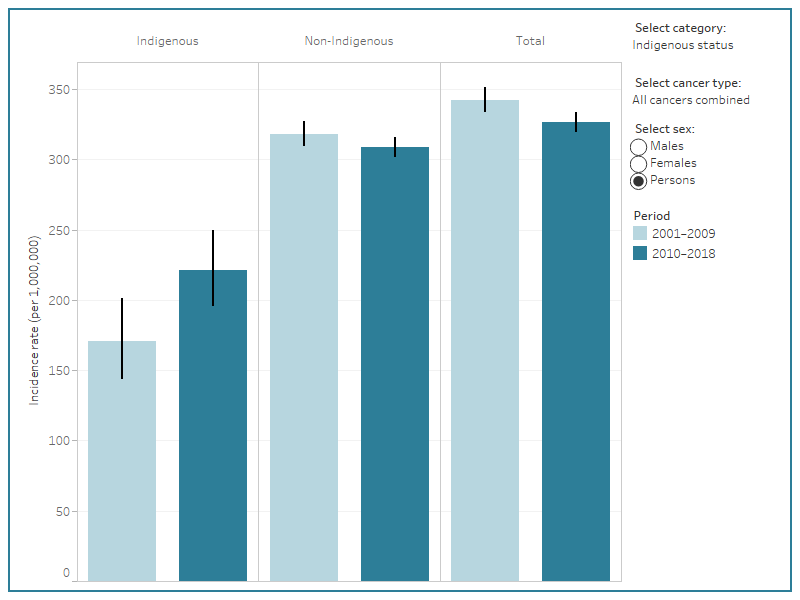
Figure 5 describes cancer incidence for people aged 15–24 from each of the key populations, who were diagnosed with cancer in 2001–2009 and 2010–2018.
Cancers are classified using the revised SEER recode adjusted to Australian conditions. The reader can select which population and cancer to report.
Because of the relatively small numbers of cases diagnosed in many of the populations, cancer type has been restricted to Tier1 cancer groups and the most commonly diagnosed Tier2 cancers (see Section 1.5 and Appendix A1 in the report). Note that data for all cancers are described in the excel data tables.
Figure 5: Incidence rates, by cancer and sex, for people aged 15–24 in key populations
This is a bar chart displaying incidence rates for adolescents and young adults. It can be filtered by cancer type, sex, and type of key population (Indigenous status, remoteness, socioeconomic index, and state or territory). 95% confidence intervals accompany each bar.

Notes:
- | denotes 95% confidence interval.
- Q1 denotes the most disadvantaged group and Q5 the least disadvantaged group.
- Indigenous status data for 2001–2009 includes NSW, Qld, WA and NT and for 2010–2018 includes NSW, Vic, Qld, WA and NT.
- All data are available in the excel data tables.
Sources: Australian Cancer Database 2018, National Mortality Database 2020.
Survival
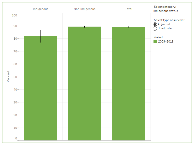
Figure 6 describes 5-year relative survival for people aged 15–24 from each of the key populations in 2009–2018.
The reader can select which population to report and whether relative survival is to be adjusted or not.
Due to small numbers, survival data is only displayed for all cancers combined and for persons.
Relative survival has been adjusted to the national incidence distribution, across cancer sites, for that period. Since survival varies considerably with the site of the cancer, survival for these national subpopulations is highly dependent on the incidence distributions for each subpopulation. When comparing survival between subpopulations, adjustment to a standard incidence distribution across cancer sites removes this effect which enables a comparison of survival rates based on a consistent incidence distribution.
Figure 6: 5-year adjusted and unadjusted relative survival for people aged 15–24 in key populations
This is a bar chart that displays 5-year relative survival for cancer for adolescents and young adults. It can be filtered to show adjusted or unadjusted survival as well as categories for key populations. These categories are Indigenous status, remoteness, socioeconomic indexes, and states and territories.

Notes:
- | denotes 95% confidence interval.
- Q1 denotes the most disadvantaged group and Q5 the least disadvantaged group.
- Indigenous status data includes NSW, Vic, QLD, WA and NT.
- All data are available in the excel data tables.
Source: Australian Cancer Database 2018.
Mortality
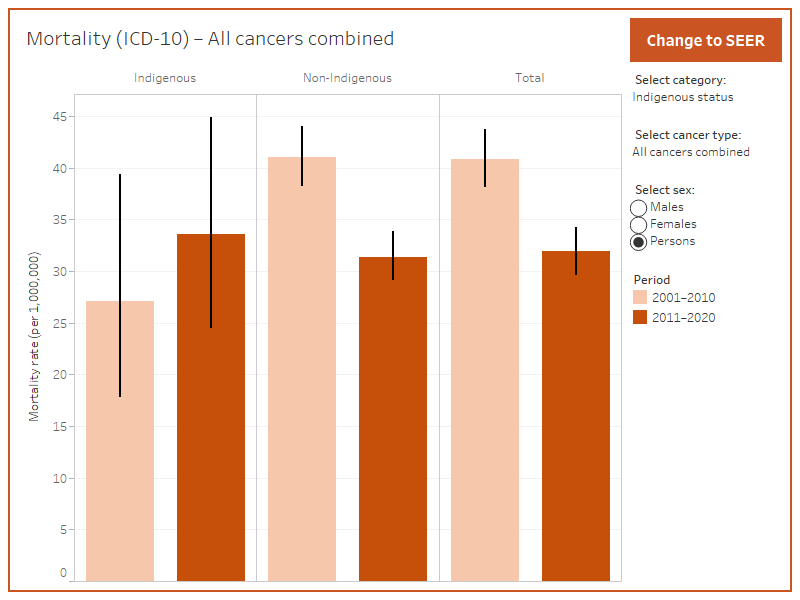
Figure 7 describes cancer mortality for people aged 15–24 from each of the key populations in the two most recent decades for which reporting is possible.
The reader can select which population and cancer (as well as which cancer categorisation (SEER or ICD-10) to report.
The mortality data can be viewed according to 2 different types of cancer classification: cancer histology (using the revised SEER recode) and cancer site (using the ICD-10 categorisation). For cancer histology (SEER), only Tier1 cancer groupings (see Section 1.5 and Appendix A1 in the report) are displayed due to the small numbers of deaths and resultant volatility in many of the populations. For the same reason, only the ten ICD-10 defined cancer sites with the highest death rates are displayed. Readers are encouraged to interpret the data cautiously, with the understanding that rates are based on small numbers, with rates showing considerable volatility in many cases.
While the range of cancers described here is restricted, data for all cancers are described in the excel data tables.
Figure 7: Mortality rates, by cancer and sex, for people aged 15–24 in key populations
This is a bar chart displaying mortality rates for adolescents and young adults. It can be filtered by cancer type, sex, and type of key population (Indigenous status, remoteness, socioeconomic index, and state or territory). 95% confidence intervals accompany each bar.

Notes:
- | denotes 95% confidence interval.
- Q1 denotes the most disadvantaged group and Q5 the least disadvantaged group.
- Indigenous status data for 2001–2010 and 2011–2020 includes NSW, Qld, WA, SA and NT, for 2013–2017 includes NSW, Vic, Qld, WA and NT.
- All data are available in the excel data tables.
Sources: Australian Cancer Database 2018 and National Mortality Database 2020.


