Triage category 4 and 5
Half of all presentations were classified as Semi-urgent or Non-urgent
This section looks at Triage category 4 Semi-urgent and category 5 Non-urgent presentations in more detail, exploring when people arrived to the ED, how they arrived, and if they were admitted to hospital (including referrals to other hospitals for admission).
In 2018−19, nearly half of all Emergency presentations (Type of visit) were classified as Semi-urgent (39% or 3.2 million presentations) or Non-urgent (7.5% or 613,000 presentations) (Box 3). These included presentations where people arrived by ambulance (13% of Semi-urgent and Non-urgent presentations), or were subsequently admitted to hospital (16%).
The time emergency presentations occurred, if people arrived by ambulance, or if people were admitted to hospital, varied considerably between the triage categories, and across local areas. Understanding this variation can help health planners identify if and when care could be provided in an alternate setting, such as by a primary health care service.
Use the interactive data visualisations to explore Semi-urgent and Non-urgent presentations in more detail between 2015−16 and 2018−19. Refer to the Technical note for further details about the measures included.
Box 3: Emergency presentations
All measures in this report only include Emergency presentation type of visits. This excludes ED presentations that were planned return visits, pre-arranged admissions, patients in transit, and patients who were dead on arrival, all of which accounted for 2% of presentations to the ED in 2018–19. See the Technical note for further details.
More Non-urgent ED presentations occurred mid-morning
One-quarter (25%) of people triaged as Non-urgent presented to the ED between 9am and 12pm. In comparison, 19% of Semi-urgent presentations, and 16% of Triage 1 Resuscitation, 2 Emergency and 3 Urgent presentations (combined) occurred in this period (Figure 4).
Figure 4: Proportion of ED presentations by time of presentation and Triage category, 2018–19
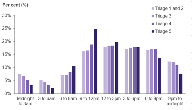
Note: Includes presentations with an Emergency presentation type of visit only.
Source: AIHW analysis of the NNAPEDCD, 2018–19.
People from regional areas triaged as Non-urgent were less likely to be admitted
Around 1 in 5 people triaged as Semi-urgent were admitted to hospital (18% or 572,000 presentations), while 1 in 20 people triaged as Non-urgent were admitted (5.4% or 33,000 presentations). People living in metropolitan PHN areas who were triaged as Non-urgent were more likely to be admitted to hospital (6.7% of presentations) than their regional counterparts (4.4%).
The proportion of people triaged as Semi-urgent and Non-urgent who arrived by ambulance was similar for metropolitan (14%) and regional PHN areas (13%), but varied considerably across the country, ranging from 6.0% for people living in Country WA PHN area to 24% for people living in Northern Queensland PHN area.
Tableau 4: PHN profile – Number of ED presentations by triage category
This dynamic vertical stacked bar chart shows the number of ED presentations by hour and triage category for each PHN area. Results are presented by year (2015–16 to 2018–19). Refer to ‘PHN – Use by hour’ in the data tables.
Tableau 5: Number of ED presentations by hour, triage category and PHN area, 2015–16 to 2018–19
This dynamic line graph shows the number of ED presentations by hour, triage category and PHN area. PHN areas have been assigned into two groups: Metropolitan and Regional. Results are presented by year (2015–16 to 2018–19). Refer to ‘PHN – Use by hour’ in the data tables.
Tableau 6: Number and percentage of ED presentations that arrived by ambulance or were admitted to hospital, by triage category and PHN area, 2015–16 to 2018–19
This dynamic dashboard presents two bar graphs side by side. The first bar graph shows the percentage, or number of ED presentations that arrived by ambulance, by triage category and PHN area. The second bar graph shows the percentage, or number of ED presentations that were subsequently admitted to hospital, by triage category and PHN area. Refer to ‘PHN – Arrivals & Admissions’ in the data tables.
