Appendix: Images of supplementary suicide rate interactive graphs

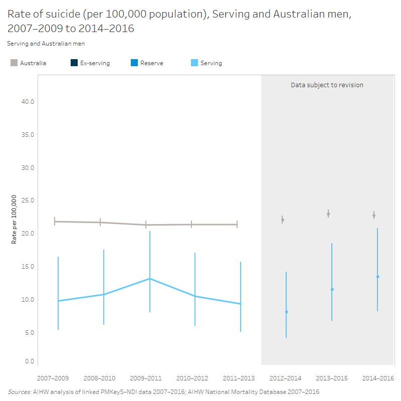
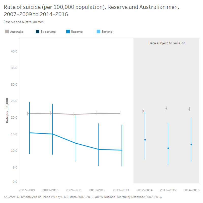
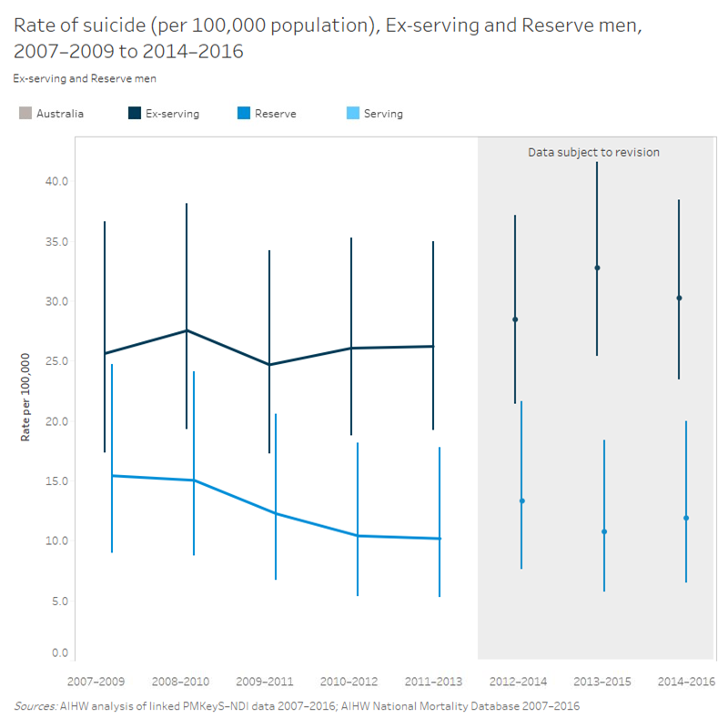
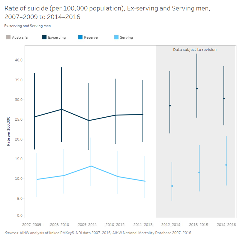
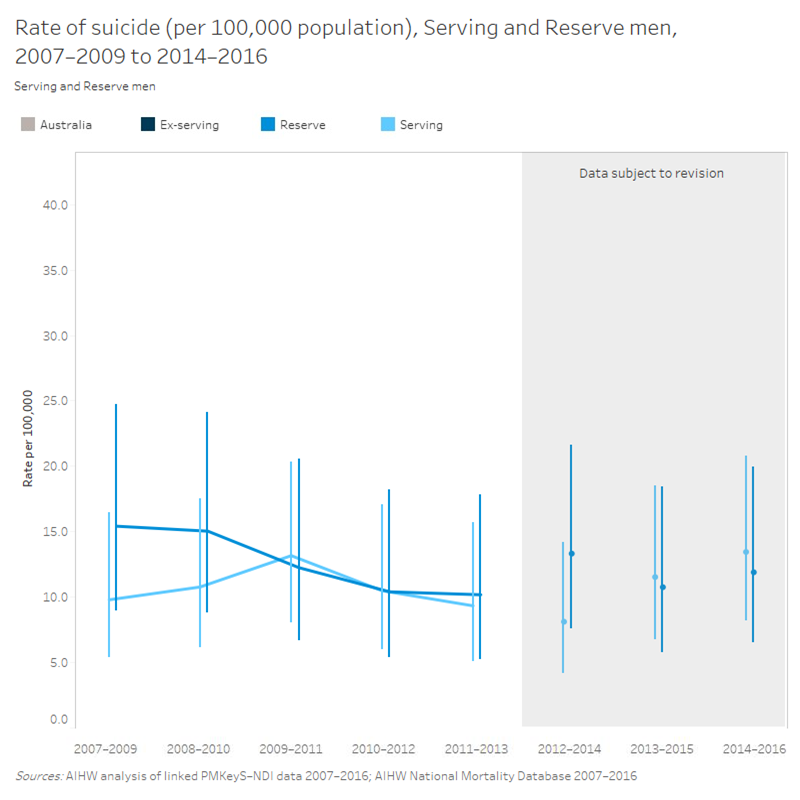
Rate of suicide by service status (men)

This is a line graph showing the rate of suicide per 100,000 population for serving males and Australian males, between the 3-year periods 2007-2009 and 2014-2016. The datapoints for serving males are below the equivalent datapoints for Australian males. Differences are statistically significant for all datapoints except 2009-2011. The datapoints from 2012-2014 to 2014-2016 are subject to revision.

This is a line graph showing the rate of suicide per 100,000 population for reserve males and Australian males, between the 3-year periods 2007-2009 and 2014-2016. The datapoints for reserve males are below the equivalent datapoints for Australian males. Differences are statistically significant for the datapoints 2010-2012, 2011-2013, 2013-2015, and 2014-2016. The datapoints from 2012-2014 to 2014-2016 are subject to revision.

This is a line graph with two series showing the rate of suicide per 100,000 population for reserve males and ex-serving males, between the 3-year periods 2007-2009 and 2014-2016. The datapoints for reserve males are below the equivalent datapoints for ex-serving males. Differences are statistically significant for the datapoints 2010-2012, 2011-2013, 2013-2015, and 2014-2016. The datapoints from 2012-2014 to 2014-2016 are subject to revision.

This is a line graph with two series showing the rate of suicide per 100,000 population for serving males and ex-serving males, between the 3-year periods 2007-2009 and 2014-2016. The datapoints for serving males are below the equivalent datapoints for ex-serving males. Differences are statistically significant for all datapoints except 2009-2011. The datapoints from 2012-2014 to 2014-2016 are subject to revision.

This is a line graph with two series showing the rate of suicide per 100,000 population for serving males and reserve males, between the 3-year periods 2007-2009 and 2014-2016. Differences are at no point statistically significant. The datapoints from 2012-2014 to 2014-2016 are subject to revision.

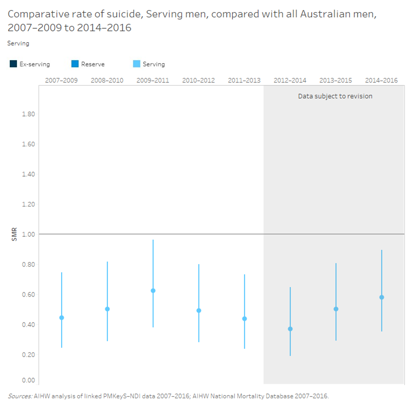
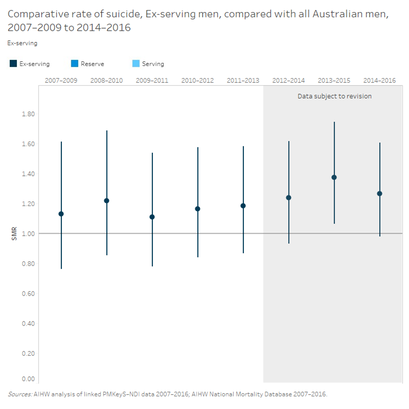
Age-adjusted suicide rates (standardised mortality ratios) by service status (men)

This is a data series that gives the Standardised Mortality Ratios (SMRs) for serving males between the 3-year periods 2007-2009 and 2014-2016. There is a horizontal line representing the value of 1, indicating the comparison value with the Australian population. All SMRs are below the line, with all differences being statistically significant. The datapoints from 2012-2014 to 2014-2016 are subject to revision.

This is a data series that gives the Standardised Mortality Ratios (SMRs) for ex-serving males between the 3-year periods 2007-2009 and 2014-2016. There is a horizontal line representing the value of 1, indicating the comparison value with the Australian population. All SMRs are above the line, with differences not being statistically significant except for the point 2013-2015. The datapoints from 2012-2014 to 2014-2016 are subject to revision.

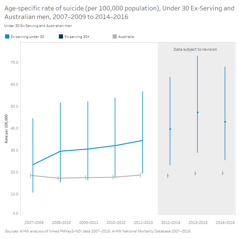
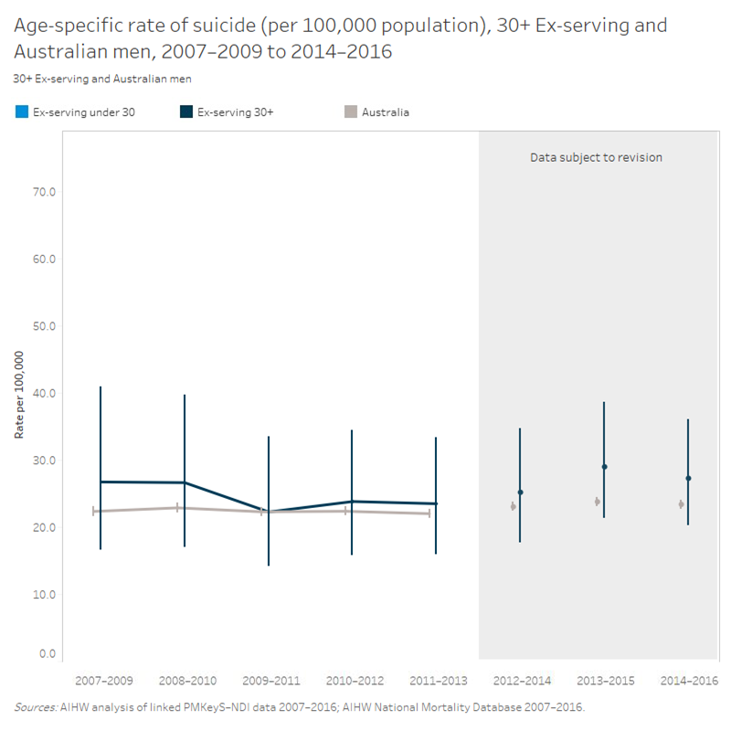
Suicide rates by age (ex-serving men, aged under 30 and aged 30 years and over)

This is a line graph with two series showing the rate of suicide per 100,000 population for ex-serving males aged under 30 years and Australian males, between the 3-year periods 2007-2009 and 2014-2016. The datapoints for ex-serving males aged under 30 years are above the equivalent datapoints for Australian males. Differences are statistically significant for the datapoints 2012-2014, 2013-2015, and 2014-2016. The datapoints from 2012-2014 to 2014-2016 are subject to revision.

This is a line graph with two series showing the rate of suicide per 100,000 population for ex-serving males aged 30 years and over and Australian males, between the 3-year periods 2007-2009 and 2014-2016. Differences are at no point statistically significant. The datapoints from 2012-2014 to 2014-2016 are subject to revision.