Comparisons over time
Changes in burden over time from specific diseases or injuries may be due to changes in population size, population ageing, changes in disease prevalence, epidemics or changes to how causes are reported or coded in health data.
For fatal burden (YLL) estimates, notable changes in cause of death coding practices occurred over time for dementia and accidental poisoning. For non-fatal burden (YLD) estimates, morbidity data was drawn from a wide variety of sources, with varying availability and data quality over time. Therefore, comparisons over time needs to be interpreted with caution. Refer to the Quality information on YLD estimates and Frequently asked questions pages for further information.
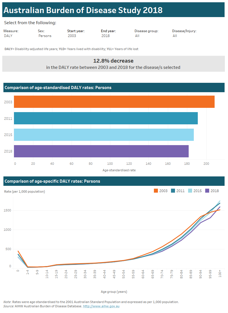
Use the interactive graphs to explore differences in age-standardised and age-specific rates of burden (DALY, YLD or YLL) in Australia for 2003, 2011, 2015 and 2018. Estimates are displayed by sex and for disease groups or by specific disease or injury.
Note that care should be taken when comparing disease level information in age groups over 85 years. Data for this population is often limited, leading to greater variability.
See Chapter 7 in the Australian Burden of Disease Study: impact and causes of illness and death in Australia 2018 report for more information on changes over time in disease burden.
This interactive data visualisation compares burden of disease in Australia over time for the years 2003, 2011, 2015 and 2018. There are 3 sections which can be customised to report data according to type of burden, start year, end year, sex, disease group and disease. The first section is a sentence which report the percent change (increase or decrease) in the rate of burden between the start and end year selected and according to the type of burden, sex, disease group and disease selected. The second section is a horizontal bar chart which compares the age-standardised rate of burden for each year according to the type of burden, start year, end year, sex, disease group and disease selected. The third section is a line graph which compares age-specific rates of burden for each year according to the type of burden, start year, end year, sex, disease group and disease selected.

Please use the ‘Download’ button at the bottom of the dashboard to generate image or PDF versions of the data.


