Air pollution
In 2018, 1.3% of the total disease burden in Australia was due to air pollution.
These estimates reflect the amount of burden that could have been avoided if all people in Australia were not exposed to particulate matter 2.5μg/m3 (PM2.5).
Air pollution was causally linked to 6 diseases—coronary heart disease, chronic obstructive pulmonary disease (COPD), stroke, type 2 diabetes mellitus, lung cancer and lower respiratory infections (see ABDS 2018 Risk factor estimates data table).
How much burden was attributable to air pollution?
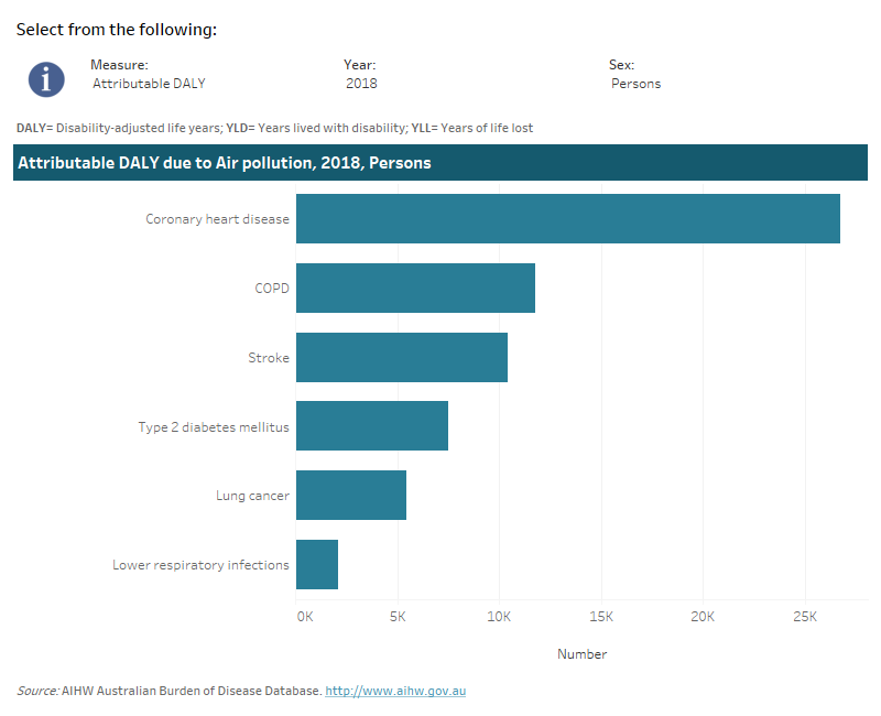
Air pollution was responsible for 8.6% of coronary heart disease total burden, 8.3% of stroke burden, 6.7% of both COPD and type 2 diabetes burden, 5.7% of lower respiratory infections burden and 3.4% of lung cancer burden.
This interactive data visualisation shows the burden attributable to air pollution by linked disease. The main section shows a horizontal bar graph which can be customised to report data according to year, sex and measure of attributable burden. Each bar represents the attributable burden of the disease linked to air pollution.

How did burden attributable to air pollution vary by age and sex?
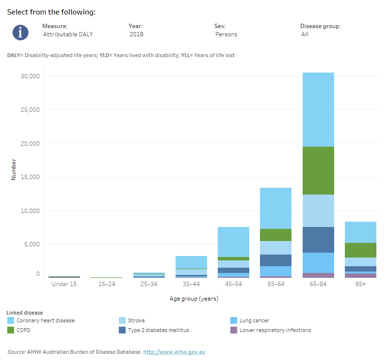
The majority of the total burden due to air pollution occurred in older Australians— over the age of 65.
In people aged 65 years and over, the most burden due to air pollution was from coronary heart disease followed by COPD. For those under 65 years, most burden was also from coronary heart disease followed by stroke.
Males experienced more burden due to air pollution compared with females up to age 84; whereas females experienced more total burden due to air pollution from age 85 onwards.
This interactive data visualisation shows the amount of burden attributable to air pollution by age group and linked disease. The main section shows a stacked bar graph which can be customised to report data according to year, sex, disease group and measure of attributable burden. Each bar represents the attributable burden within a particular age group. Each bar is also split into separate components with each colour representing a disease linked to air pollution.

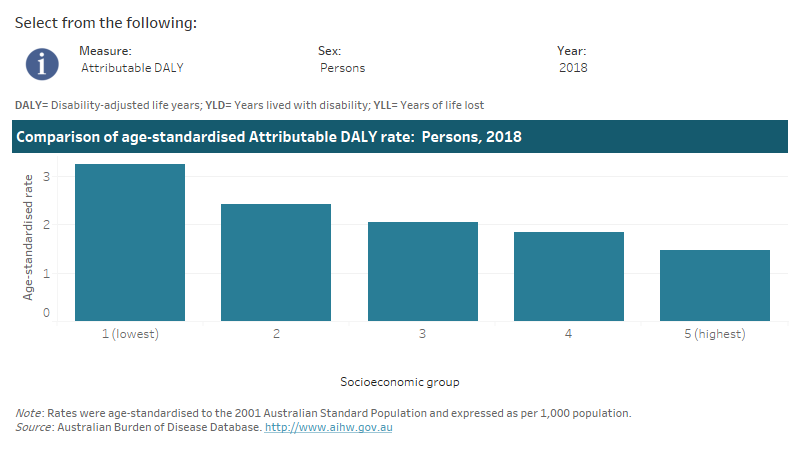
This interactive data visualisation shows the rate of burden attributable to air pollution by socioeconomic group. The main section shows a bar graph which can be customised to report data according to year, sex and measure of attributable burden. Each bar represents the attributable burden within a particular socioeconomic group due to air pollution.


