Remoteness areas
This section focuses on the variability of burden across the 5 remoteness areas, rather than the detailed estimates for a particular remoteness category. It is worth noting that there are a range of important demographic, socioeconomic and environmental factors that differ by remoteness which influence health status. Health behaviours and risks may also differ by remoteness (AIHW 2014b).
Disease burden, as well as the gap in burden, among Aboriginal and Torres Strait Islander people in 2018 and 2011 are presented by sex and disease group for the 5 remoteness categories: Major cities, Inner regional, Outer regional, Remote and Very remote. In 2018, most (62%) of Australia’s Aboriginal and Torres Strait Islander population lived in Major cities and Inner regional areas. However, remote areas have higher proportions of Aboriginal and Torres Strait Islander people resident there.
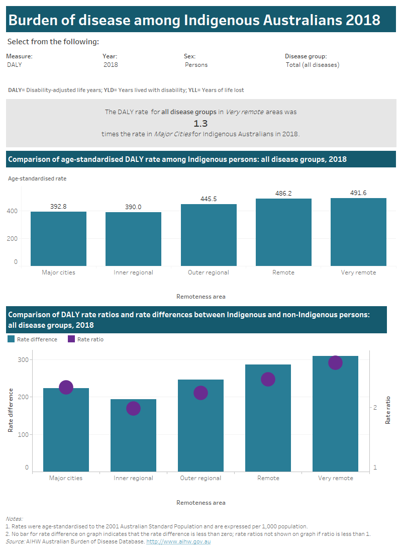
Use the interactive graph to explore disease burden (DALY, YLD or YLL) among Indigenous Australians for the 5 remoteness areas by sex and disease group in 2011or 2018.
See Chapter 10 in the Australian Burden of Disease Study 2018: impact and causes of illness and death in Aboriginal and Torres Strait Islander people report for more information estimates by remoteness areas.
This interactive data visualisation compares burden of disease in Australia by remoteness area. There are 3 sections which can be customised to report data according to type of burden, year, sex and disease group. The first section has a sentence that reports how many times higher the rate was in Very remote areas compared with Major Cities for the selected type of burden, year, sex and disease group. The second section is a column chart which reports the age-standardised rate of burden (per 1,000 population) for each remoteness area for the selected type of burden, year, sex and disease group. The third section is a column chart which reports the rate difference and rate ratio, between Indigenous and non-Indigenous Australians, for each remoteness area for the selected type of burden, year, sex and disease group.

Please use the ‘Download’ button at the bottom of the dashboard to generate image or PDF versions of the data.


