Annual health assessments
Measure 2.1.1 The number of Indigenous Australians who had an Indigenous health assessment (MBS item 715 or 228) including a health assessment provided via videoconference or teleconference (MBS item 92004, 92011, 92016, 92023), proportion of the population and age-standardised rates
Where a person had both an in-person health check and a telehealth check in a year, one health check was selected at random for inclusion in the analysis.
All Aboriginal and Torres Strait Islander Australians, regardless of age, are eligible for an Indigenous-specific health assessment which includes an eye health check.
Figure 2.1.1: Annual health assessments
There are 6 separate charts for this measure, showing MBS health assessments, for Indigenous Australians by various characteristics.
Number and proportion of Indigenous Australians that had an MBS health assessment, 2019–20 and 2020–21
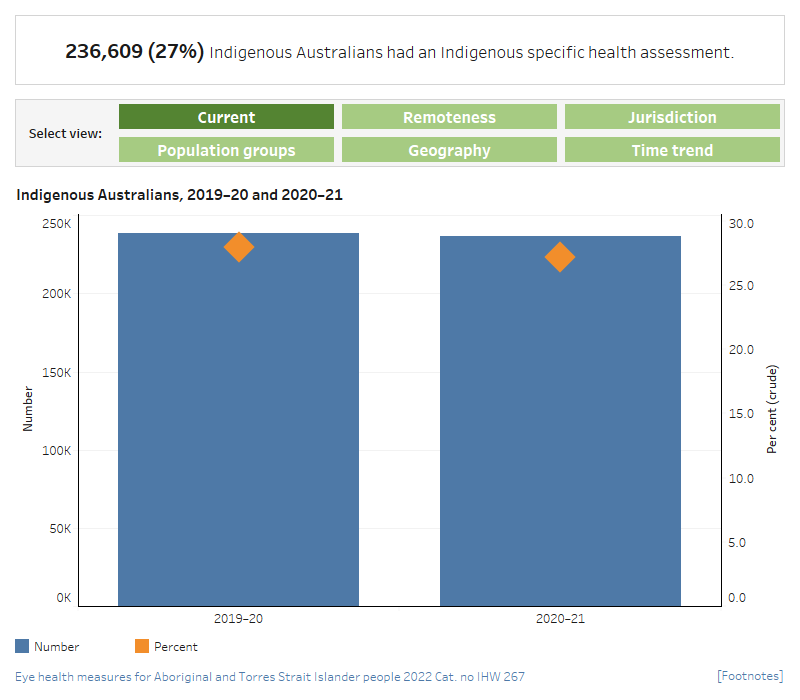
This dual axis combined vertical bar chart and scatter plot displays the number and proportion of MBS health assessments in 2019–20 and 2020–21. The chart shows that 28% of Indigenous Australians (or 236,609 people) had Indigenous-specific MBS health assessments in 2020–21. This is a decline of 2,228 assessments from 2019–20.
Proportion of the Indigenous population that had an MBS health assessment by region, 2020–21
This vertical bar chart compares the proportion of MBS health assessments in 2020–21, by remoteness category of geographic location. The chart shows that the proportion of MBS 715 health assessments was the same in Outer regional and Remote areas (33%). The proportion was lowest in Major cities (24%).
Proportion of the Indigenous population that had an MBS health assessment by jurisdiction, 2020–21
This vertical bar chart compares the proportion of MBS health assessments in 2020–21, by state and territory. The chart shows that the proportion of MBS health assessments was highest in Queensland (34%) and the Northern Territory (32%) and was lowest in Tasmania and Victoria (16% and 14%, respectively).
Proportion of the Indigenous population that had an MBS health assessment by age and sex, 2020–21
This grouped vertical bar chart compares the proportion of MBS item 715 health assessments in 2020–21, by age and sex. The chart shows that the number and proportion of MBS health assessments were very similar for Indigenous males and females aged 0–14— 27% and 25%, respectively. For all other age groups, health assessments for Indigenous females outnumbered those for Indigenous males.
Proportion of the Indigenous population that had an MBS health assessment by PHN, 2020–21 (bar chart)
This horizontal bar chart shows the proportion of MBS health assessments in 2020–21, by PHN. The chart shows that the PHNs with the lowest proportion of health assessments were Northern Sydney (5.2%) and South Eastern Melbourne (7.1%), while those with the highest rates were Western NSW and Brisbane North (both 36%).
Proportion of the Indigenous population that had an MBS health assessment by age, 2010–11 to 2020–21
This line graph shows changes in the proportion of MBS health assessments, from 2010–11 to 2020–21, by age group. The chart shows that, between 2010–11 and 2020–21, the age-standardised proportion of MBS health assessments increased over time. This increase occurred across all age groups, but was highest for those aged 65–74 and 75 and over (from around 18% to around 39% for both groups).

- In 2020–21, just under one-third (236,609 or 27%) of Indigenous Australians had an Indigenous-specific health assessment. This included over 11,000 health assessments provided via videoconference or teleconference (see Indigenous health checks and follow ups, supplementary tables).
- The age-standardised proportion of Indigenous Australians who had a health assessment increased from around 9% in 2010–11 to 28% for the under 15 age group and 23% for the 15–24 age group in 2018–19, before declining to 26% and 22% for both age groups, respectively, in 2020–21. For those aged 65 and over the proportion rose from 18% in 2010–11 to around 37% in 2017–18, before plateauing at around 39% from 2018–19 to 2020–21.
- In 2020–21, the number and proportion of Indigenous males aged 0–14 who had a health assessment was slightly higher than the number and proportion of females—38,838 (27%) and 34,241 (25%), respectively. For all other age groups, health assessments for Indigenous females outnumbered those for Indigenous males.


