Cancer incidence by age visualisation
For many different cancers, this data visualisation provides cancer incidence data by age for a wide range of age groups. Help with terms, and information about the data, is available by placing the mouse pointer over the icons found near the top of the page.
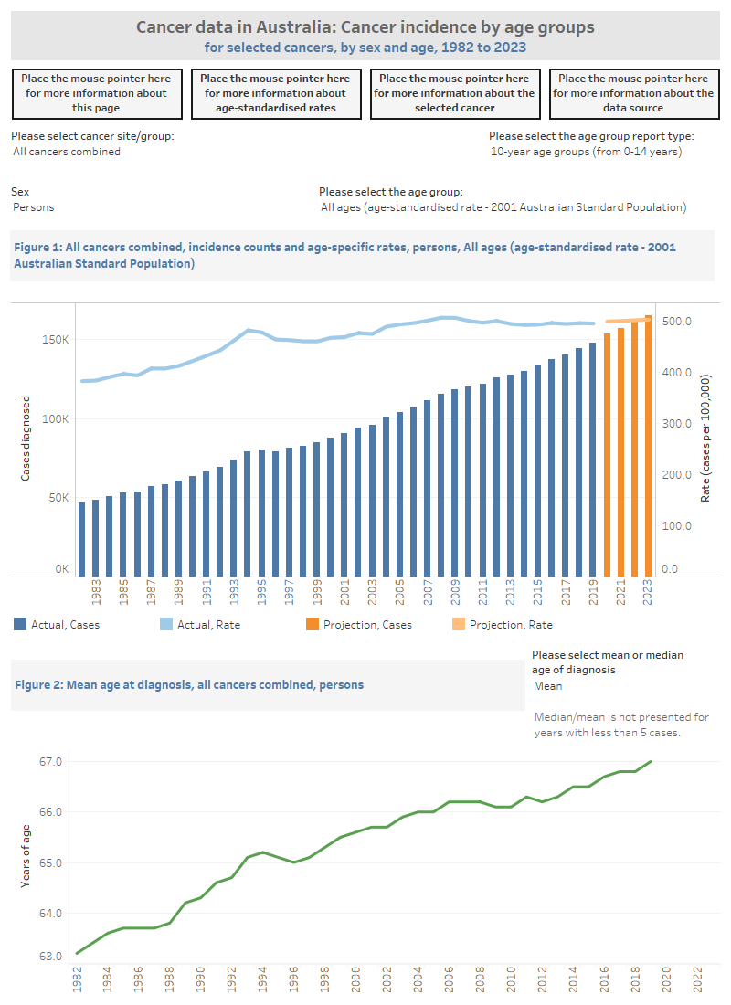
This cancer incidence visualisation contains two figures. The visualisation presents statistics for the selected cancer and provides information by sex.
Figure 1 is a line and bar graph that contains information on the number of cancer cases diagnosed (bar chart) and the rate of diagnosis (line graph) from 1982 to the most recent year available for reporting at the time of release. For a selected age group (other than all ages), the line graph represents the age-specific rate. The crude rate or age-standardised rate can be selected for all ages. Age-group reporting can be selected by 5-, 10-, 15-, 20-, 25-, 30-, 35-, 40-, 45- and 50-year age groups.
Figure 2 is a line graph that contains mean or median age (in years) at cancer diagnosis from 1982 to most recent year available for reporting at the time of release.
The visualisation includes information about many different cancers and the statistics within this visualisation are available in Excel format within the Data section of this report.

Cancer incidence by age data are available as supplementary tables.


